

Your home might be secretly telling the world it’s stuck in 2015. The good news? Refreshing your space doesn’t mean gutting your budget or starting from scratch. A few strategic swaps can bring your rooms into 2026 without the renovation headache.
Trends move fast in the design world, and what felt fresh a few years ago can now make your space feel dated. Gray-on-gray kitchens, word art, and all-white everything have had their moment, but they’re no longer signaling the contemporary, stylish home you’re aiming for. What’s quietly aging your space isn’t always obvious, but once you spot these outdated choices, you’ll start seeing them everywhere.
This guide walks you through 15 home trends that have overstayed their welcome, explains exactly why they’re reading as tired rather than timeless, and offers budget-friendly alternatives that work for renters and homeowners alike. You’ll learn what to replace, what to keep, and how to make thoughtful updates that won’t feel just as dated in two years. Whether you’re planning a weekend refresh or a room-by-room evolution, you’ll know exactly where to focus your energy for maximum impact.
How We Chose These Outdated Trends
We didn’t just pick trends that feel tired to us. Each item on this list meets at least one of four key criteria: it’s been so overused that it’s lost its impact, it’s firmly anchored to a specific decade that’s passed, professional designers are actively steering clients away from it, or it lacks the versatility to adapt as your taste evolves.
We’ve also been deliberate about balancing perspectives. Some outdated trends affect homeowners who can make permanent changes, while others plague renters stuck with landlord choices. You’ll find both budget-friendly swaps and splurge-worthy investments here, because good design isn’t about how much you spend. It’s about making thoughtful choices that feel fresh and authentic to you, whether you’re painting rental cabinets or renovating your forever home.
1. All-Gray Everything
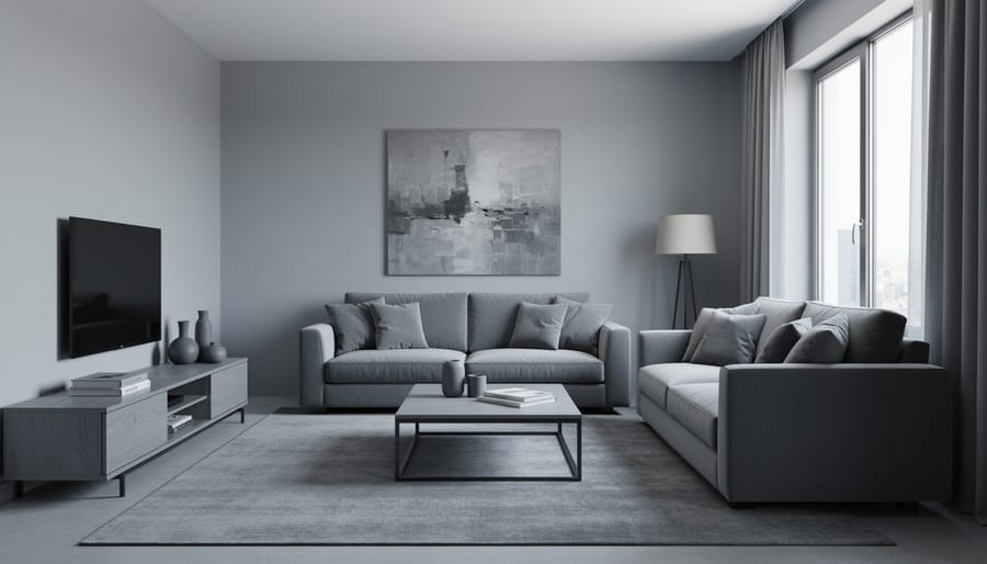
The monochromatic gray trend swept through homes like wildfire in the 2010s, promising a sophisticated, modern aesthetic. Fast forward to 2026, and those all-gray spaces often feel more like waiting rooms than warm, inviting homes. When everything from walls to furniture to accessories exists in the same grayscale spectrum, rooms lose depth and character.
The issue isn’t gray itself, it’s a lovely accent color. The problem is saturation. Wall-to-wall gray creates a flat, one-dimensional look that can make spaces feel cold and institutional, especially in rooms without abundant natural light.
The good news? Shifting away from this trend doesn’t require a complete overhaul. Start by introducing warmer neutrals like cream, beige, or greige into your neutral color palette. Layer in earthy tones through textiles, think terracotta throw pillows, warm wood accents, or a jute rug. Even small pops of color in artwork or plants can break up the monotony and breathe life back into gray-heavy rooms without spending a fortune.
2. Chevron Patterns Everywhere
The chevron zigzag pattern hit peak saturation around 2012 and hasn’t let up since. While the bold V-shaped stripes initially felt fresh and energetic, their appearance on everything from throw pillows to shower curtains to entire accent walls created visual fatigue. The high-contrast repetition can make a room feel restless and dated, particularly when chevron dominates multiple surfaces in one space.
The pattern’s rigidity is part of the problem, it lacks the organic flow that helps designs age gracefully. In smaller doses, chevron might still work, but wall-to-wall applications now scream mid-2010s Pinterest board rather than current designer kitchen ideas or living spaces.
For a more timeless approach, consider subtle geometric patterns like classic herringbone or simple stripes with varied spacing. Organic, flowing patterns, botanical prints, abstract watercolor effects, or gentle curves, create visual interest without the aggressive repetition. A single chevron accent piece won’t ruin your room, but retiring the pattern from starring roles gives your space room to breathe.
3. Overly Distressed Furniture
The heavily distressed furniture trend, think pieces intentionally beaten up with chains, sanded aggressively, or painted and then scraped to reveal multiple layers underneath, had its moment during the farmhouse craze. But there’s a fine line between charming patina and furniture that looks like it survived a battle.
When distressing is overdone, pieces can read as artificially aged rather than authentically vintage. The effect often feels forced, especially when every item in a room has the same degree of wear. Real antiques develop character naturally over decades of use, with distress marks appearing in logical places where hands actually touched or items rubbed against surfaces.
If you love vintage appeal, seek out genuinely old pieces from estate sales or antique shops. Their wear patterns tell real stories. Alternatively, embrace clean-lined modern furniture that won’t feel dated in five years. You can always mix one authentic vintage piece into a contemporary space for character without the theme-park effect of wall-to-wall distressing.
4. Excessive Open Shelving in Kitchens
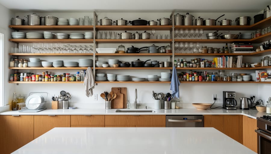
Open shelving exploded in popularity as kitchens embraced an airy, farmhouse-inspired aesthetic, but wall-to-wall exposed storage has proven more aspirational than practical for most households. Unless you’re committed to constant styling and dusting, those Instagram-perfect shelves quickly become a cluttered eyesore. Grease and kitchen grime settle on everything, dishes need to be washed before use, and the pressure to keep everything looking magazine-ready is exhausting.
The smarter approach blends function with style: incorporate one or two open shelves to display your prettiest dishes or everyday glassware, then rely on closed cabinetry for the rest. This gives you focal points to style thoughtfully while hiding the mismatched storage containers and random appliances that real kitchens contain. Consider floating shelves in warmer neutrals or natural wood to soften the look, flanking a window or framing your range.
If you’re renting with existing open shelving you can’t remove, pare down what you display. Keep only pieces you genuinely use and love, leaving breathing room between items rather than cramming every inch.
5. Word Art and Inspirational Quote Signs
Those mass-produced signs proclaiming “Live, Laugh, Love,” “Gather,” or “Blessed” have lost their impact through sheer ubiquity. What might have felt charming and personal in 2015 now reads as generic filler that could belong in anyone’s home. The problem isn’t inspirational messaging itself, but rather the cookie-cutter execution that reveals nothing about who actually lives in the space.
Original artwork, even budget-friendly prints from independent artists, brings far more character to your walls. Your personal photographs, especially when thoughtfully framed and arranged, tell your actual story rather than a manufactured sentiment. If words matter to you, consider displaying a handwritten recipe from a grandparent, a meaningful quote in beautiful calligraphy you create yourself, or vintage book pages framed as art.
The shift toward authentic, personal décor doesn’t require spending more. Thrift stores overflow with interesting frames and vintage finds. Create your own canvas art with paint samples, fabric scraps, or pressed botanicals. These pieces spark genuine conversation and reflect your individual taste in ways that generic word art never could.
6. Shiplap Accent Walls
Shiplap transformed from a charming architectural detail into an inescapable farmhouse cliché. What began as Joanna Gaines’ signature touch quickly spread to every room in every home, and the oversaturation has rendered it visually tired. When every surface gets the horizontal plank treatment, spaces start to feel one-note and lack architectural interest.
The biggest issue with shiplap accent walls is how they date your home to a very specific era. In ten years, they’ll scream “2010s renovation” the same way chair rails announced “1990s builder special.” The repetitive lines can also make rooms feel busier rather than calmer, especially in smaller spaces where you want simplicity.
For a fresher approach, consider textured wallpaper with subtle dimension or a classic board-and-batten treatment that offers vertical interest instead. Sometimes the boldest move is the simplest: a single wall painted in a rich, saturated color creates drama without overwhelming the space. If you’re updating a kitchen, browse modern kitchen inspiration to see how designers are using material contrast and color instead of relying on wood planks. These alternatives offer personality and sophistication without feeling like you bought the farmhouse starter pack.
7. Matching Furniture Sets
Walk into any furniture showroom and you’ll find complete bedroom or living room sets: matching dresser, nightstands, bed frame, all in identical finishes. While convenient, these matchy-matchy ensembles create spaces that feel more like catalog pages than real homes.
Perfectly coordinated sets lack the visual interest that comes from layering different textures, finishes, and design periods. When every piece shares the same wood tone and hardware, the room feels one-dimensional and forgettable. There’s no focal point, no story, nothing that reveals who actually lives there.
The good news? Breaking away from matching sets actually saves money. Instead of dropping thousands on a complete package, build your room gradually. Start with one quality anchor piece, like a solid wood dresser from a vintage shop or a statement sofa. Add complementary items over time: a sleek modern nightstand beside a traditional bed frame, or mismatched accent chairs flanking your sofa.
This collected approach creates depth and character while letting you invest in pieces you genuinely love rather than settling for the whole set compromise.
8. Tuscan-Inspired Kitchen Décor
The heavy, ornate Tuscan kitchen aesthetic that peaked in the early 2000s now feels decidedly dated. Think faux-finished walls in burnt orange and terracotta, dark wood cabinetry, wrought iron accents, grape and vineyard motifs, and tumbled stone backsplashes in earth tones. While the intention was warmth and old-world charm, these kitchens often ended up feeling dark, cluttered, and overly themed.
If you love Mediterranean style, there’s a lighter way to capture that essence. Consider crisp white or soft cream cabinetry paired with natural wood accents and simple subway tile. A few artisan ceramics or a bowl of fresh lemons delivers Mediterranean warmth without the heavy-handed theming. For those ready to move on entirely, clean-lined contemporary kitchens with neutral palettes and quality materials create timeless appeal. You can always layer in warmth through textiles, cutting boards, and cookware rather than permanent fixtures that scream a specific era.
9. Wall-to-Wall Carpeting in Bold Colors
Wall-to-wall carpeting in bold colors or busy patterns instantly ages a home. That seafoam green shag or burgundy Berber might have felt luxurious in the 1990s, but today it anchors your space to a specific era and makes rooms feel smaller and darker. Even neutral wall-to-wall carpeting can look dated when it shows wear patterns or matted traffic paths.
Hardwood floors or luxury vinyl plank offer timeless appeal and easier maintenance. They brighten spaces, show off area rugs you can swap seasonally, and generally increase home value. If you’re a homeowner ready to invest, removing old carpeting often reveals salvageable hardwood underneath. Luxury vinyl planks provide a budget-friendly alternative that mimics wood convincingly and installs over existing floors.
Renters facing dated carpeting have options too. Large area rugs can cover most of the offending carpet while adding your personal style. Choose neutral rugs that ground the space without competing with the existing color. You can also negotiate with landlords about replacing egregiously worn carpeting or ask if you can install peel-and-stick vinyl tiles that remove cleanly when you move. Strategic furniture placement helps minimize how much dated carpeting remains visible.
10. Ultra-Glossy, Dark Wood Finishes
That ultra-glossy, almost mirror-like finish on dark mahogany or cherry furniture was everywhere in the 1990s and early 2000s. While the wood itself was often quality, those heavy, lacquered finishes now feel formal and dated, making rooms appear darker and more closed-in than necessary.
Contemporary design favors lighter, more natural wood tones that show the grain without excessive shine. Think white oak, walnut with a matte finish, or even painted wood furniture in soft neutrals. These choices brighten spaces and work with various décor styles rather than anchoring a room to a specific era.
The good news? You don’t need to replace perfectly solid furniture. Refinishing or painting existing pieces transforms them completely. Strip away that heavy finish to reveal lighter wood underneath, apply a matte sealant for protection, or paint pieces in a modern color. A dresser that felt oppressively dark becomes fresh and current with a coat of sage green or warm white paint and updated hardware.
11. Oversized, Overstuffed Leather Furniture
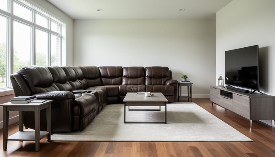
Bulky leather sectionals and oversized recliners had their moment, but these furniture behemoths often overwhelm contemporary living spaces. The problem isn’t leather itself, quality leather ages beautifully and offers timeless appeal, but rather the scale and styling of pieces designed to make a statement through sheer size alone.
Today’s homes favor furniture with cleaner lines and more thoughtful proportions. A streamlined leather sofa in cognac or charcoal provides the same durability and luxury without eating up visual space. Consider pieces with tapered legs, track arms, or mid-century modern silhouettes that feel substantial without being overbearing.
If you’re working with an existing overstuffed piece, strategic styling helps. Float furniture away from walls, add a sleek floor lamp to draw the eye upward, or balance with lighter accent chairs across the room.
For budget-conscious updates, explore faux leather options with modern profiles or reupholster a quality frame in performance fabric. The goal is creating breathing room in your space while maintaining comfort and durability.
12. Themed Rooms (Especially Nautical Bathrooms)
Walking into a bathroom plastered with anchors, fishing nets, rope mirrors, and wooden signs proclaiming “Seas the Day” feels more like a seaside gift shop than a relaxing retreat. Heavy-handed themed rooms, especially those nautical bathrooms that dominated coastal homes in the 2000s, now feel kitschy and dated rather than charming.
The problem isn’t loving the ocean or wanting a coastal vibe. It’s the literal interpretation. When every surface screams the theme through matching décor sets and obvious symbols, the space loses sophistication and becomes one-note.
Instead, channel your love for the sea through subtle design choices. A soft palette of sandy beiges, crisp whites, and muted blues instantly evokes the beach without a single anchor in sight. Natural textures like woven baskets, linen towels, and a few carefully chosen shells displayed in a glass jar create organic coastal elegance. One beautiful piece of ocean-inspired art makes a stronger statement than a dozen mass-produced “Beach House Rules” signs.
This restrained approach works for any theme, mountain lodge, Parisian apartment, or English garden. Reference the inspiration through mood and materials, not merchandise.
13. Popcorn Ceilings
Popcorn ceilings, those bumpy, textured surfaces installed throughout the 1970s and 80s, are perhaps the most universally disliked outdated feature in homes today. Originally applied to hide imperfections and dampen sound, they now just make rooms feel dated and dark, collecting dust in all those crevices.
For homeowners, removal is the gold standard solution. You can hire professionals (typically $1-3 per square foot) or DIY it, though the process is messy and time-consuming. If your home was built before 1980, test for asbestos first, some popcorn texture contains it, requiring professional abatement.
Renters and those not ready for full removal have clever workarounds. Strategic lighting draws the eye away from the ceiling: install statement pendant lights or wall sconces that illuminate walls instead. Painting popcorn ceilings a crisp white helps them recede visually. Some homeowners skim-coat over the texture for a smooth finish, a middle-ground option that’s less invasive than scraping.
This ranks among the most impactful updates you can make, right alongside kitchen refresh ideas. Smooth ceilings instantly modernize any room, making the effort worthwhile for long-term homeowners planning to stay put.
14. Excessive Throw Pillows
Remember when your sofa required a five-minute pillow removal ritual before you could actually sit down? That excessive throw pillow trend has officially overstayed its welcome. Beds stacked with a dozen pillows that get tossed on the floor every night, couches so crowded with cushions there’s no room for people, it’s decorative overkill that sacrifices function for a staged look.
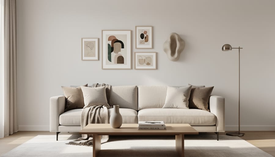
The smarter approach focuses on thoughtful curation rather than abundance. Choose three to five quality pillows in coordinating textures and colors that actually enhance comfort. Mix one solid, one pattern, and one textured piece for visual interest without chaos. This streamlined style looks intentionally designed rather than cluttered, and you’ll appreciate the practicality when you’re not wrestling with pillow mountains.
This is genuinely budget-friendly too. Fewer pillows means investing in better quality inserts and covers that’ll last. Your back and your guests will thank you for prioritizing usable seating over Instagram-ready pillow arrangements that nobody finds comfortable.
15. Builder-Grade Brass and Gold Fixtures
There’s builder-grade brass, and then there’s the warm, unlacquered brass that’s having a sophisticated moment right now. The difference? Those yellowy-gold faucets, cabinet pulls, and light fixtures from the late 1980s and 1990s often have an orangish, shiny coating that screams a specific (and very dated) era. In contrast, today’s brass revival favors matte, aged, or brushed finishes in softer tones that look intentional and refined rather than stuck in time.
If your home still sports that original builder-grade brass, replacing it delivers enormous visual bang for surprisingly little investment. A set of new cabinet pulls typically runs under fifty dollars for an entire kitchen, and modern alternatives in brushed nickel, matte black, or even contemporary unlacquered brass create a cleaner, more current look. The same goes for outdated light fixtures and bathroom faucets. You don’t need to gut the room; sometimes changing the hardware is enough to shift the whole vibe from dated to intentional.
What to Embrace Instead: Timeless Design Principles
The goal isn’t to chase every trend or overhaul your home every few years. Instead, focus on design principles that stand the test of time while allowing your personality to shine through.
Here’s what creates enduring, beautiful spaces:
- Invest in quality basics, a well-made sofa, solid wood dining table, or classic lighting will outlast trendy pieces
- Layer textures and tones instead of relying on a single color or finish throughout
- Choose classic silhouettes for major pieces, then add personality through accessories you can change seasonally
- Mix periods and styles, pair vintage finds with modern elements for depth and authenticity
- Prioritize comfort and function over appearances alone
Remember that your home should reflect who you are, not what a magazine says is current. The most successful interiors tell a story through collected pieces that matter to you. Start with a neutral foundation, then layer in color and pattern through pillows, art, and textiles you can swap out as your tastes evolve. This approach keeps your space feeling fresh without requiring expensive renovations. Style naturally changes over time, and that’s perfectly fine. Small, thoughtful updates, a new throw blanket, rearranged furniture, fresh paint, can transform a room without breaking the budget. Trust your instincts, embrace what brings you joy, and create a home that feels authentically yours.
Frequently Asked Questions
How do I update my home without a full renovation?
Start with high-impact, low-cost changes: swap out hardware and light fixtures, update textiles like curtains and throw pillows, apply a fresh coat of paint in modern colors, and edit your accessories to create breathing room. These surface-level updates can transform a space for a fraction of renovation costs.
What if I love a trend that’s considered outdated?
Your home should reflect your personality, not slavishly follow design rules. If you genuinely love something, keep it, just style it thoughtfully with fresh, current elements so it feels intentional rather than neglected. The key is confidence and curation, not trend-chasing.
How can renters update a space with outdated features?
Focus on temporary solutions: use peel-and-stick wallpaper or removable tiles, layer rugs over unattractive flooring, hang artwork strategically to draw eyes away from problem areas, and invest in good lighting to minimize dated fixtures. Most landlords allow paint with approval, which delivers tremendous impact.
What’s the difference between dated and vintage or retro?
Dated means something looks accidentally old and tired, while vintage or retro is intentionally curated with a clear aesthetic vision. A single mid-century modern chair styled with contemporary pieces reads as vintage; an entire room of 1990s matching oak furniture simply looks stuck in time.
Should I follow trends at all?
Trends can inspire and refresh your space, but they shouldn’t dictate every choice. Build your home around timeless foundations, quality furniture, neutral backbones, good lighting, then experiment with trends through easily changeable accessories, textiles, and paint colors. This approach keeps your space current without constant overhauls.
Can I mix old and new styles without looking confused?
Absolutely, and this layered approach often creates the most interesting spaces. The trick is finding a common thread, perhaps a color palette, similar wood tones, or a consistent level of formality, that ties disparate pieces together into a cohesive whole.
Remember, updating your home is a journey, not a race. You don’t need to tackle everything on this list immediately or spend money you don’t have. Even small, thoughtful changes, replacing a few outdated accessories, rearranging furniture to create better flow, or simply decluttering, can breathe new life into tired spaces. Trust your instincts, prioritize what bothers you most, and give yourself permission to evolve your style gradually as your budget and energy allow.
8 Modern Home Decor Ideas That Transform Your Space in 2026
Your home might be secretly telling the world it’s stuck in 2015. The good news? Refreshing your space doesn’t mean gutting your budget or starting from scratch. A few strategic swaps can bring your rooms into 2026 without the renovation headache. Trends move fast in the design world, and what felt fresh a few years ago can now make your space feel dated. Gray-on-gray kitchens, word art, and all-white everything have had their moment, but they’re no longer signaling the contemporary, stylish home you’re aiming for. What’s quietly aging your space isn’t always obvious, but once you spot these ...