

A neutral color palette for living room design consists of whites, beiges, grays, taupes, and soft earth tones that create a versatile, timeless foundation allowing furniture, textures, and accent pieces to take center stage. These understated hues work across any architectural style and adapt as your tastes evolve, making them the smart choice for homeowners who want lasting appeal without constant repainting.
If you’ve scrolled through designer renovation photos and wondered how professionals achieve that effortlessly pulled-together look, the answer often lies in their strategic use of neutrals. These palettes aren’t boring or lifeless when done right. They’re the secret to creating sophisticated spaces that feel calm yet intentional, luxurious yet approachable.
The beauty of working with neutrals is their flexibility across budgets. A soft greige wall costs the same as electric blue, but it gives you freedom to swap throw pillows, artwork, and accessories seasonally without clashing. You can invest in one beautiful statement sofa and change the room’s mood entirely with different textiles and accents.
This guide breaks down exactly what makes a neutral palette work in real living spaces. You’ll learn which specific neutral combinations create different atmospheres, how to layer tones without creating a flat or washed-out room, and practical techniques for adding depth through texture and contrast. Whether you’re starting from scratch or refreshing an existing space, you’ll walk away with a clear roadmap for creating the serene, stylish living room you’ve been envisioning.
What Is a Neutral Color Palette?
A neutral color palette consists of colors with low saturation and minimal intensity that create a calm, understated foundation in your living room. These hues lack strong chromatic presence, meaning they don’t lean heavily toward any single color on the spectrum, making them incredibly versatile for layering with furnishings, artwork, and accent pieces.
The core neutral family includes whites, beiges, grays, taupes, creams, and blacks, along with their countless variations. What sets these colors apart from bold or saturated hues is their ability to recede visually rather than demand attention. While a vibrant coral or emerald green immediately draws the eye, a soft greige or warm cream provides a backdrop that lets your furniture, lighting, and personal touches take center stage. This quality makes neutrals ideal for homeowners seeking both flexibility and timeless design inspiration.
Understanding the different categories of neutrals helps you make informed choices for your space:
- Warm Neutrals
- Colors with yellow, red, or orange undertones, including beiges, taupes, creams, and warm grays. These create cozy, inviting atmospheres that feel particularly welcoming in living rooms with limited natural light.
- Cool Neutrals
- Hues with blue, green, or purple undertones, such as cool grays, soft whites with blue bases, and certain taupes. They deliver crisp, modern aesthetics and work beautifully in spaces flooded with natural sunlight.
- True Neutrals
- Balanced colors without strong warm or cool leanings, like perfect grays and pure whites. These versatile shades adapt to surrounding elements and provide maximum flexibility for changing decor over time.
The beauty of neutrals lies in their restraint. They establish visual harmony without competing with your lifestyle or limiting your decorating options down the road.
How a Neutral Palette Works in Your Living Room
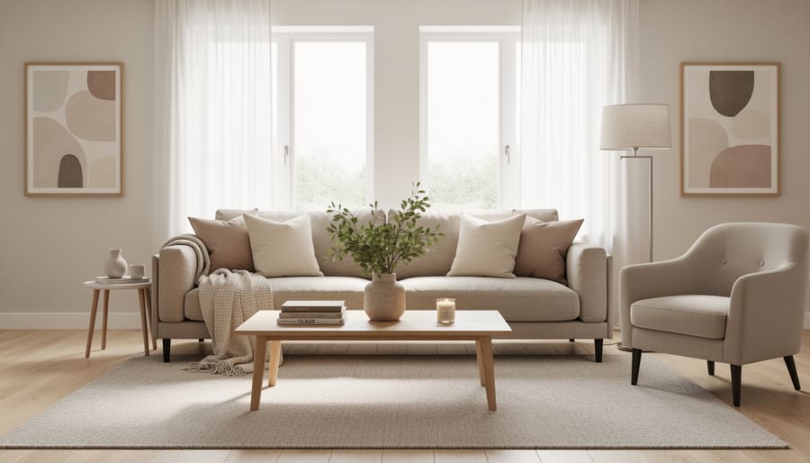
The 60-30-10 Rule for Neutrals
The 60-30-10 color rule offers a foolproof formula for distributing neutral tones throughout your living room. The concept is simple: dedicate 60% of the space to your dominant neutral (typically walls and large furniture), 30% to a secondary neutral that complements the main shade, and 10% to an accent neutral or subtle contrast.
For a warm neutral scheme, you might paint walls in a soft beige (your 60%), choose a taupe sofa and curtains (your 30%), and add depth with darker brown throw pillows and picture frames (your 10%). This distribution creates natural visual balance without requiring expensive purchases.
The beauty of applying this rule to neutrals rather than bold colors is the built-in flexibility. Your accent 10% can shift seasonally with inexpensive swaps like new cushions or a throw blanket, while your foundational layers remain constant. Many designers use this approach as the starting point for timeless palette ideas that work across different rooms.
Start by identifying your largest surfaces and work down to smaller accessories, letting the percentages guide your selections rather than strict measurements.
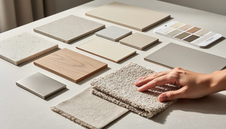
Creating Depth Without Color
Creating depth in a neutral living room doesn’t require colorful accents, it’s all about working with the subtle variations within your chosen neutral family. Start by selecting three to five shades of your base neutral, ranging from light to dark. For example, if you’re working with gray, combine dove gray walls with charcoal throw pillows and pale silver curtains.
The key is contrast. Pair your lightest shade on the largest surfaces (walls or a sofa) with progressively darker tones in smaller doses. A cream room gains dimension when you add taupe accent chairs and deep chocolate brown picture frames. This tonal layering creates natural shadows and highlights that guide the eye around the space.
Don’t forget about temperature variations within neutrals. Mixing warm-toned beige pillows with cool-toned greige upholstery adds subtle complexity. Layer different finishes too, matte paint alongside glossy ceramics and textured fabrics. These variations in tone, temperature, and sheen prevent your neutral palette from feeling flat or one-dimensional, giving your living room the sophisticated depth it needs.
Types of Neutral Palettes for Living Rooms
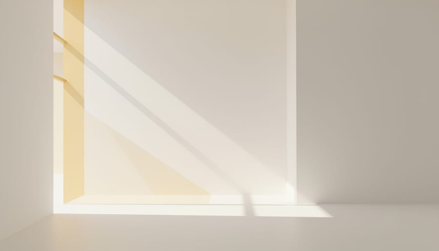
Warm Neutral Schemes
Warm neutral schemes draw from the sun-soaked end of the color spectrum: beiges, creams, taupes, and warm grays with brown or yellow undertones. These colors wrap a living room in a welcoming, cozy atmosphere that feels naturally lit even on overcast days.
Beige remains the workhorse of warm neutrals, ranging from sandy tones to deeper camel shades. Cream adds softness without the starkness of pure white, while taupe bridges beige and gray with subtle sophistication. Warm grays, often called “greige” when they lean heavily beige, offer a contemporary take on traditional warm palettes.
These schemes work particularly well in rooms with limited natural light or north-facing windows, as they inject warmth that cooler palettes can’t match. Pair them with natural wood tones, brass fixtures, and warm-toned textiles like cognac leather or rust-colored throw pillows. The result is a living room that invites you to sink into the sofa and stay awhile, perfect for homes prioritizing comfort over minimalist austerity.
Cool Neutral Schemes
Cool neutral schemes lean toward grays with blue or green undertones, crisp whites, and soft silvers that create a fresh, contemporary atmosphere. These palettes work beautifully in living rooms with abundant natural light or modern architectural features like exposed steel, concrete, or large windows.
Start with a pale gray or cool white as your dominant color, think shades that feel clean rather than warm. Layer in deeper charcoal or slate tones through an accent wall, area rug, or upholstered pieces. The cooler undertones naturally recede, making spaces feel larger and airier.
Blue-tinged neutrals like greige with cool undertones or soft dove gray add subtle color without overwhelming the palette. These shades pair exceptionally well with chrome hardware, glass coffee tables, and linen fabrics in white or light gray.
Cool neutrals complement minimalist and Scandinavian design styles particularly well, though they can feel stark without proper layering. Balance the crispness with warm wood tones or natural fiber textures.
Greige and Balanced Neutrals
Greige emerged as the design world’s answer to the warm-versus-cool neutral debate. These gray-beige hybrids blend the best of both worlds, creating a balanced foundation that adapts to changing light and pairs easily with other colors.
The magic of greige lies in its chameleon quality. In morning light, it may read slightly warmer; by evening, it shifts cooler. This flexibility makes greige forgiving if you’re unsure whether your space has warm or cool undertones. Popular greige paint colors like Benjamin Moore’s Revere Pewter or Sherwin-Williams’ Accessible Beige work in rooms with various exposures.
When working with greige, pay attention to undertones. Some lean purple-gray, others have green hints. Test samples on your walls at different times of day before committing. Pair greige walls with crisp white trim for definition, or layer multiple greige tones in upholstery and rugs for a sophisticated, cohesive look that feels intentional rather than matchy.
Monochromatic Neutral Palettes
A monochromatic neutral palette takes a single neutral color, say, warm taupe or soft gray, and uses its full range of shades, tones, and tints throughout the living room. You might paint walls in a mid-tone gray, choose a darker charcoal sofa, add pale gray throw pillows, and incorporate silvery accents in lamps or frames. This approach creates cohesive neutrals that flow seamlessly from one element to another, eliminating the guesswork of coordinating multiple color families.
The result feels intentional and sophisticated without requiring a designer’s eye. Because everything shares the same color base, the space naturally harmonizes. Varying the values, from nearly white to deep charcoal within the same neutral family, prevents monotony and adds subtle dimension. This strategy works beautifully on tight budgets since you’re only buying paint in one color family, and mismatched furniture pieces blend together when they share the same tonal range.
Layered Neutral Palettes
Layered neutral palettes take a more adventurous approach by mixing warm and cool neutrals in the same space. You might pair a warm beige sofa with cool gray walls and taupe accent chairs, creating visual rhythm without jarring color clashes. The secret lies in choosing neutrals with similar depth, all light, all medium, or all deep, so they feel intentionally coordinated rather than mismatched.
This technique shines on tight budgets because you can incorporate what you already own. That cream throw blanket works alongside your gray curtains and beige rug when you add textural variety. Linen pillows, a chunky knit throw, a jute pouf, and smooth ceramic lamps create distinct layers that catch light differently throughout the day.
The layered approach also gives you flexibility to shift the room’s mood seasonally. Add warmer neutrals like camel and cream in winter, then swap in cooler whites and grays for summer freshness, all while maintaining your neutral foundation.
How to Use a Neutral Palette in Your Living Room
Budget-Friendly Ways to Go Neutral
Transforming your living room to a neutral palette doesn’t require a complete furniture overhaul or expensive designer pieces. Start with paint, which delivers maximum impact for minimal cost, a gallon runs $25-40 and can transform a dated wood coffee table or colorful bookshelf into a cohesive neutral piece. Choose satin or matte finishes in whites, grays, or soft taupes to refresh what you already own.
Slipcovers offer another budget-smart solution, letting you convert a bold-colored sofa into a neutral centerpiece for $50-150. Washable cotton or linen-blend slipcovers in cream, beige, or gray disguise worn upholstery while supporting your palette shift.
Thrift stores and online marketplaces become goldmines when you’re hunting neutrals. Look for solid-colored pieces in beiges and grays rather than patterns, since neutral items often get overlooked by shoppers seeking statement furniture. A $30 secondhand armchair in taupe delivers the same visual effect as a $400 new one.
Focus spending on high-impact areas like throw pillows, area rugs, and curtains in neutral tones. These accessories cost less than furniture but dramatically shift a room’s overall color story, letting you achieve a designer look without the designer price tag.
Adding Texture for Visual Interest
The secret to preventing a neutral living room from looking flat lies in strategic texture layering. Without color variation to create interest, tactile differences become your primary design tool.
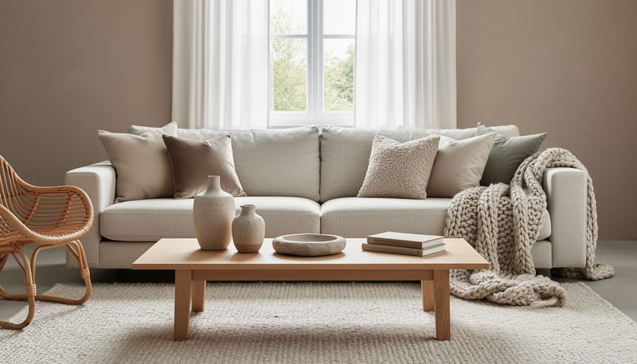
Start with textiles in varied weaves: a chunky knit throw draped over smooth linen upholstery creates immediate contrast. Add a jute or sisal rug beneath, its rough, organic texture grounds the space while complementing soft fabrics. Layer curtains by pairing sheer voile panels with heavier cotton or linen drapes for dimensional window treatments.
Introduce natural wood elements through coffee tables, floating shelves, or picture frames. The grain patterns add visual movement that solid-colored walls cannot provide alone. Mix wood finishes rather than matching everything perfectly, weathered oak alongside walnut creates authentic, collected charm.
Metal accents in brushed brass, matte black, or aged bronze bring reflective surfaces that catch light differently throughout the day. Picture frames, lamp bases, and cabinet hardware all contribute to this textural conversation.
Woven baskets, ceramic vases with visible texture, and stone accessories complete the layered effect without introducing color.
Common Questions About Neutral Living Room Palettes
Making the leap to a neutral palette often raises concerns, especially if you’re used to more colourful spaces. Here’s what homeowners typically wonder when considering this approach.
Won’t a neutral living room look boring or bland?
Not if you layer textures and vary your tones. A neutral palette becomes interesting through the interplay of materials like chunky knits, smooth leather, woven baskets and natural wood rather than relying on colour for visual appeal.
How do I choose between warm and cool neutrals?
Look at your living room’s natural light and existing elements. Rooms with abundant sunlight handle cool grays well, while spaces with limited light feel cozier with warm beiges and creams. Test paint samples on your walls at different times of day before committing.
Can I add pops of colour to a neutral palette later?
Absolutely. That’s one of the biggest advantages of starting with neutrals as your foundation. You can easily swap in coloured throw pillows, artwork or accessories with the seasons or as your taste evolves without repainting or replacing major pieces.
How do I prevent my neutral space from looking washed out?
Include at least one darker anchor piece, whether that’s a charcoal sofa, black window frames or a deep taupe accent wall. The contrast between light and dark neutrals creates the depth that keeps your room from feeling flat.
The key is remembering that neutral doesn’t mean uniform. Your palette should include a range of values from light to dark, and you’ll want variation in both sheen and texture across surfaces. A cream linen sofa paired with a glossy white coffee table and matte gray walls already offers more visual complexity than many colourful rooms achieve. Start with confidence in your foundational neutrals, then adjust accessories and accents as you live in the space and discover what feels right.
Types or components
A neutral color palette consists of several essential components that work together to create a cohesive living room design. The foundation starts with your base neutraltypically the wall color that sets the room’s overall tone. This might be a warm white, soft greige, or cool gray that covers the largest surface area.
Your anchor neutral comes next, usually appearing in major furniture pieces like sofas or area rugs. This shade should have enough contrast with your base to define the space without clashing. Think a beige sofa against greige walls, or a charcoal gray sectional in a light-toned room.
Accent neutrals add depth through smaller elements, throw pillows, curtains, occasional chairs, or decorative objects. These can be slightly darker or lighter variations of your primary neutrals.
Finally, textural elements serve as components themselves: wood finishes, woven baskets, linen fabrics, and metal fixtures. These materials introduce visual interest without adding color, preventing the flat appearance that sometimes plagues neutral spaces. Each component plays a specific role in building a balanced, sophisticated living room.
uses
A neutral color palette serves multiple practical purposes in living room design beyond simple aesthetics. These versatile schemes work exceptionally well for creating cohesive open-plan spaces where the living room flows into dining or kitchen areas, maintaining visual harmony throughout. Neutral palettes provide the perfect canvas when you’re staging a home for sale, appealing to the broadest range of potential buyers without polarizing preferences.
For renters, neutral schemes offer a strategic advantage since they work within most lease agreements while still allowing personal expression through removable elements like throw pillows, artwork, and rugs. These palettes excel at making small living rooms feel more spacious by reflecting light and eliminating visual clutter that bold colors can create.
Neutral foundations prove invaluable when you’re working with existing furniture pieces in various styles or inherited items you’re not ready to replace. They accommodate seasonal decorating shifts without requiring full room overhauls, making holiday styling or summer-to-winter transitions effortless and budget-friendly. For those seeking renovation inspiration neutral palettes provide timeless backdrops that won’t feel dated as trends evolve, protecting your investment while maintaining flexibility for future updates.
A neutral color palette for your living room offers something rare in interior design: a foundation that works beautifully right now and adapts gracefully as your style evolves. Unlike trendy color schemes that feel dated within a few years, neutrals provide lasting appeal while giving you the freedom to refresh your space simply by swapping pillows, art, or accessories rather than repainting entire rooms.
You don’t need to transform your entire living room overnight. Start with one element, perhaps a neutral slipcover for your sofa or a fresh coat of greige paint on an accent wall, and notice how it changes the feel of the space. These small steps build confidence and help you discover which neutral tones resonate with your personal style without major financial commitment.
The beauty of mastering neutrals in your living room is that the principles translate throughout your home. Once you understand how warm beiges create flow or how layered textures prevent monotony, you can carry that knowledge into bedrooms, dining areas, and entryways. Your living room becomes a proving ground for a cohesive, sophisticated approach that makes your entire home feel intentional and pulled together, all while respecting your budget and timeline.
15 Outdated Home Trends to Leave Behind in 2026
A neutral color palette for living room design consists of whites, beiges, grays, taupes, and soft earth tones that create a versatile, timeless foundation allowing furniture, textures, and accent pieces to take center stage. These understated hues work across any architectural style and adapt as your tastes evolve, making them the smart choice for homeowners who want lasting appeal without constant repainting. If you’ve scrolled through <a href="https://www.home-and-bedroom.com/25-designer-kitchen-photos-to-inspire-your-next-renovation/">designer renovation photos</a> and wondered how professionals achieve that effortlessly ...